Chicago Soccer
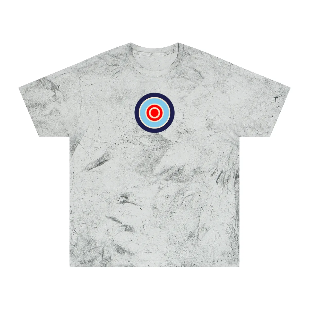
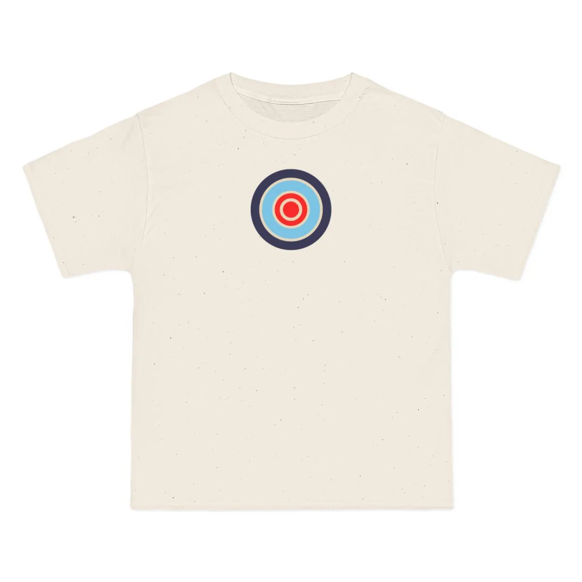
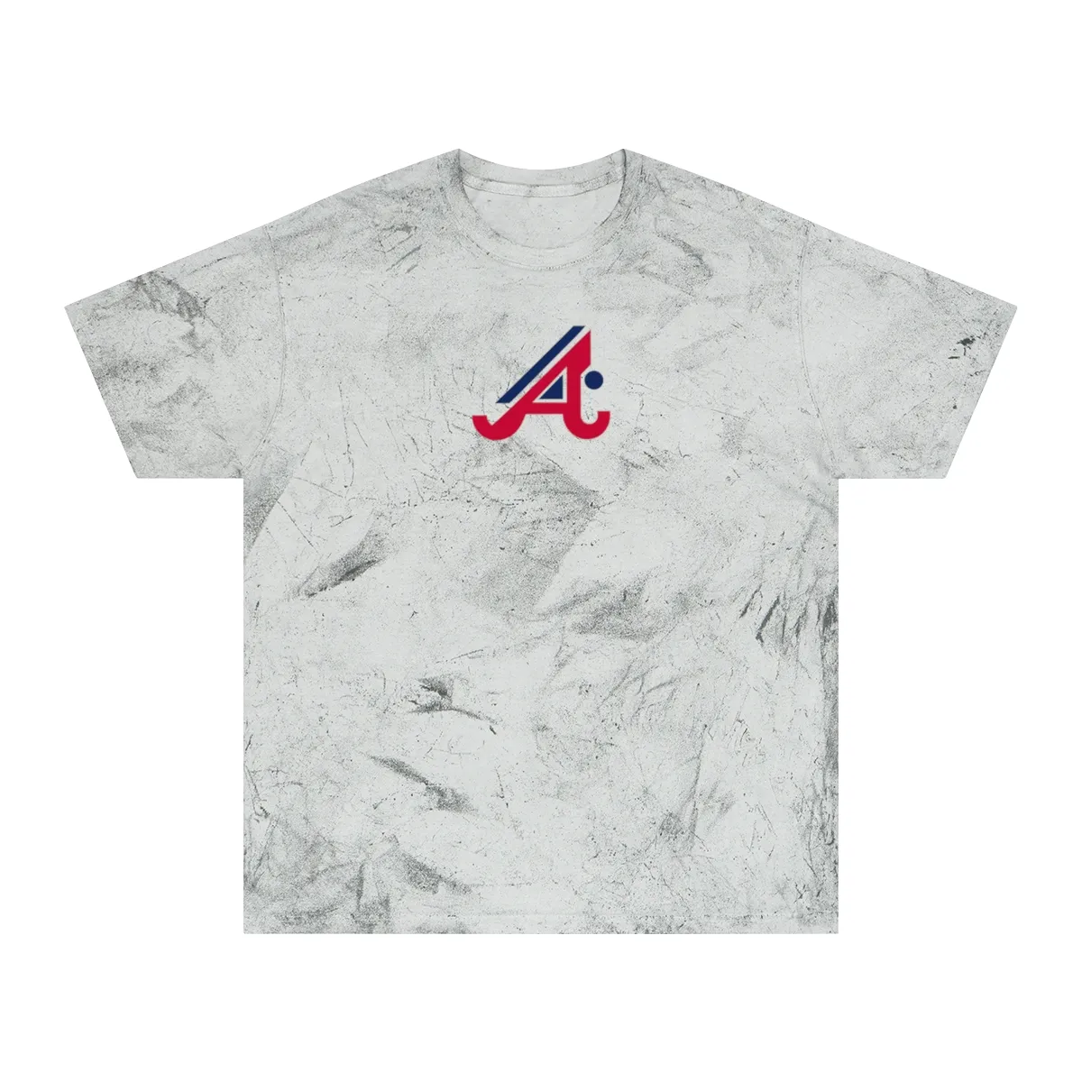
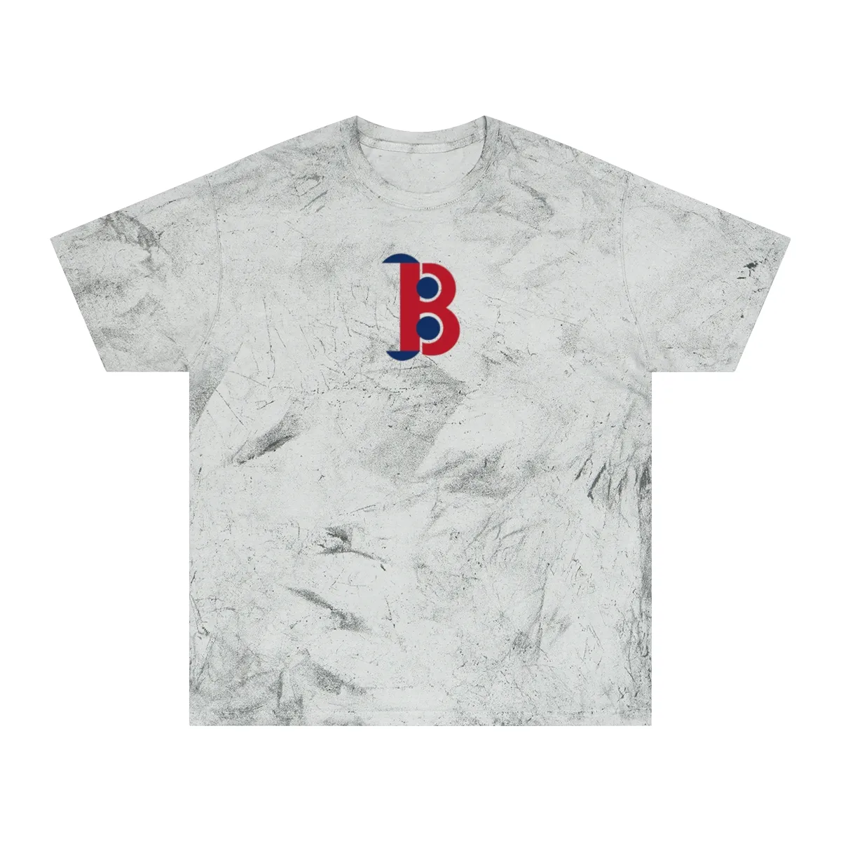
Navy, Grey & White
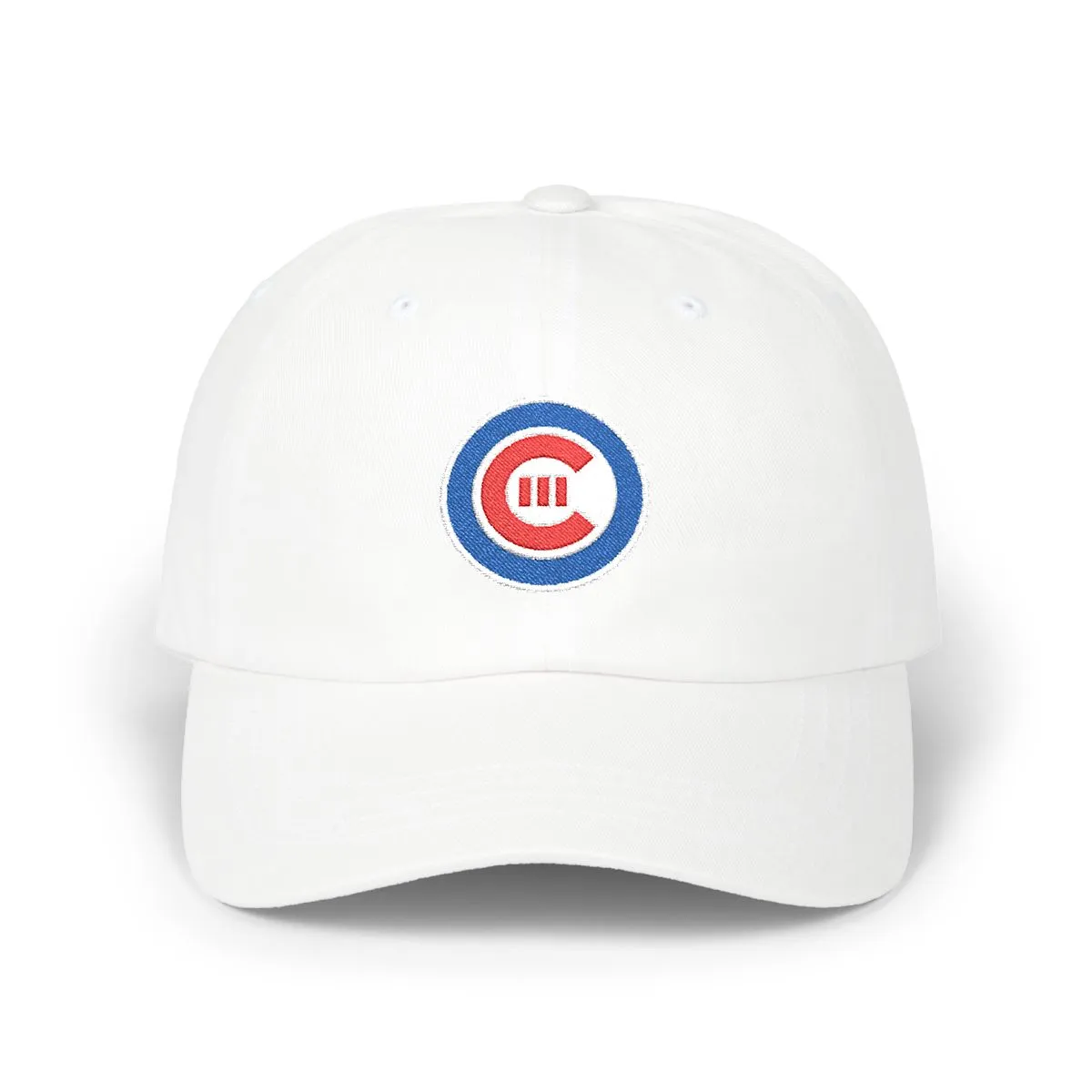
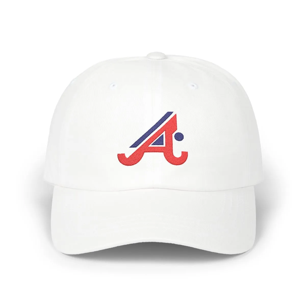
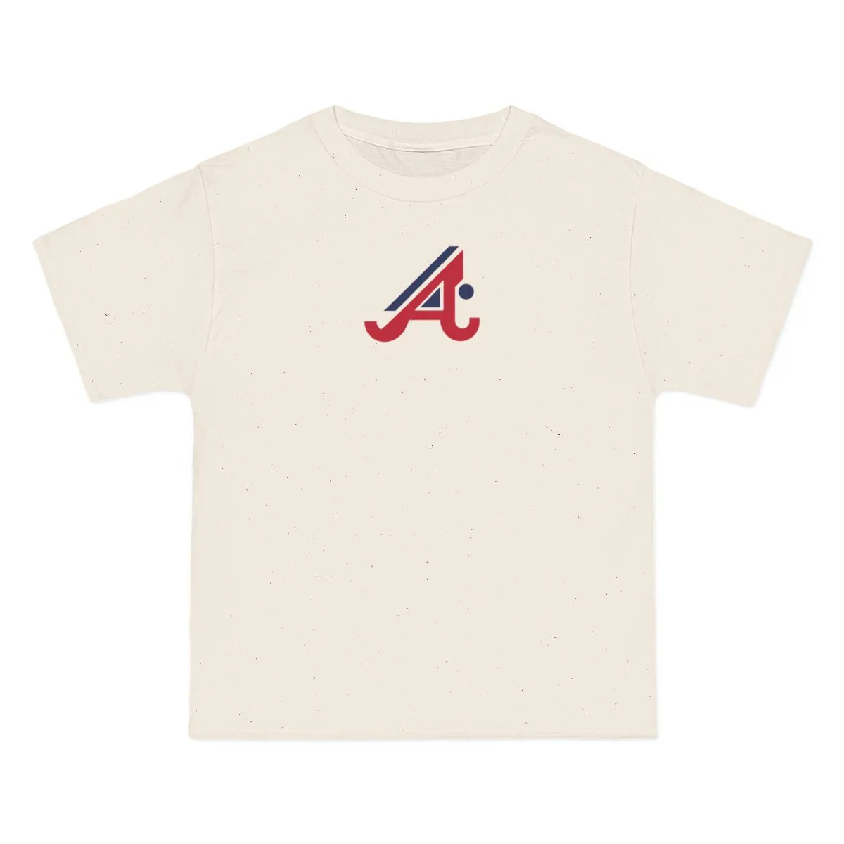
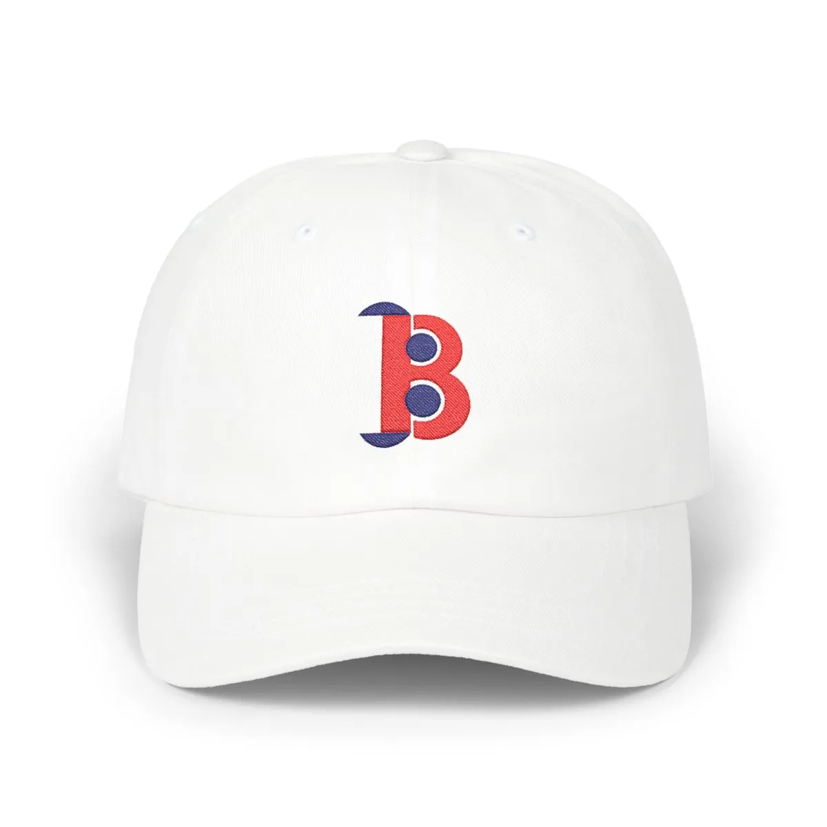
An abstract interpretation of the Royal, White & Red colorway.
style
size
Royal, White & Red — the colors Chicago has worn since 1876
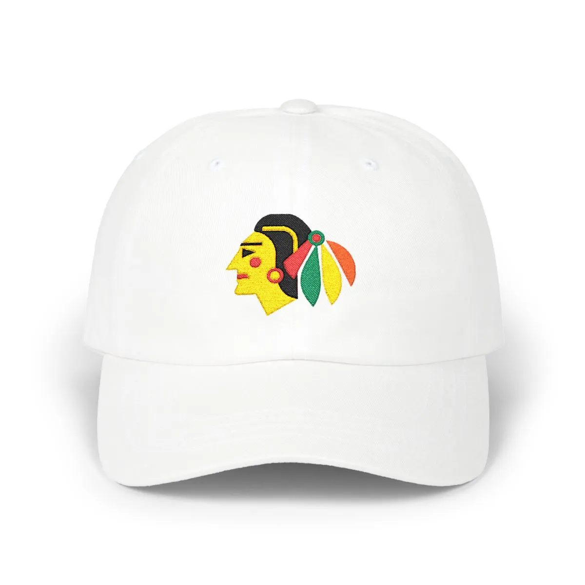
This cap draws from the visual identity of Chicago's baseball scene, translating it into pure geometry. The Royal, White & Red palette is a direct reference to the city's professional club, founded in 1876. It’s a nod to the ivy-covered outfield wall and the history of the game here, stripped of any wordmark or mascot.
For Chicagoans in Wrigleyville, Lakeview, or Lincoln Park, this is city pride expressed quietly. It’s for those who know the colors but don't need the logo. An unstructured cotton dad cap, it’s a piece of the Midwest's baseball culture, rebuilt as abstract art for everyday wear.
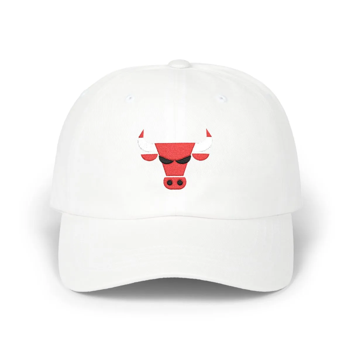
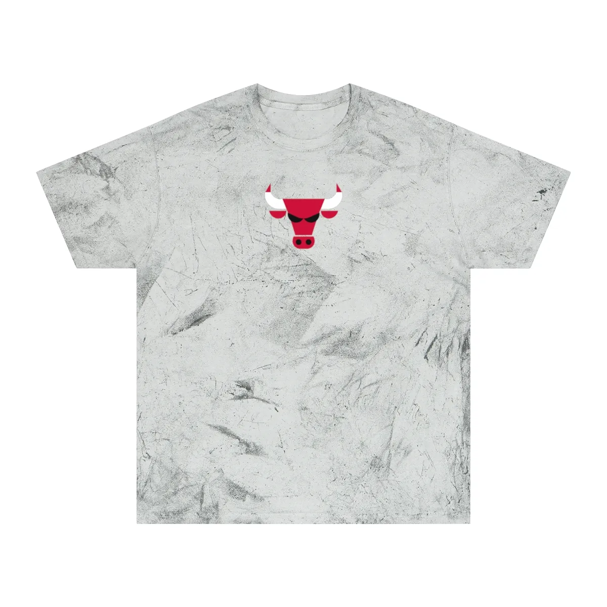
The design is an abstract composition of geometric shapes in Royal, White, and Red. It is inspired by the color palette and crest geometry of Chicago's professional baseball club, but it contains no logos, mascots, or text.
This is a logo-free, unbranded piece of apparel. It is designed for people who want to represent their city and its sports culture through color and abstract form, rather than wearing an official team mark.
No. This is an independent design that uses the city's colors and abstract geometry. It is not affiliated with, endorsed by, or licensed from any professional sports team or league.
It is an unstructured cotton dad cap. This style has a soft, low-profile crown that conforms to the head and a slightly curved brim, offering a casual and comfortable fit.
Navy, Grey & White
Red, White & Black
Orange & Navy
Gold, Black & Kelly Green
Red, Grey & Black
Red & Navy
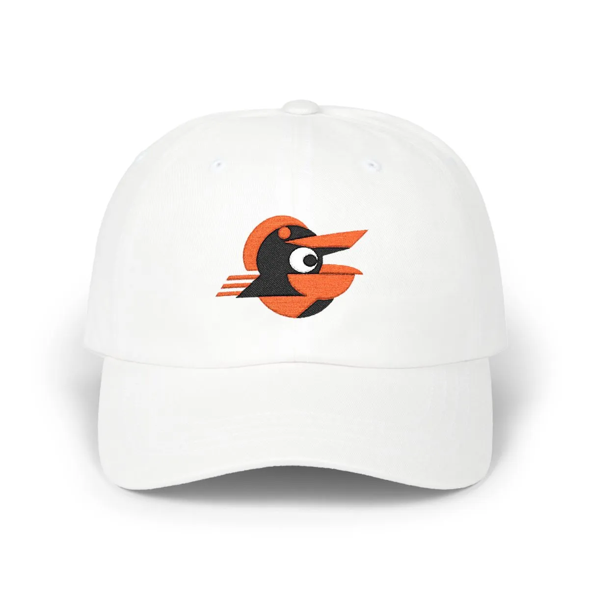
Orange, Black & White
Red & Navy
Not affiliated with, endorsed by, or licensed by any team, league, or organization.