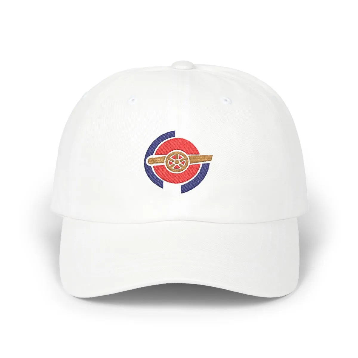
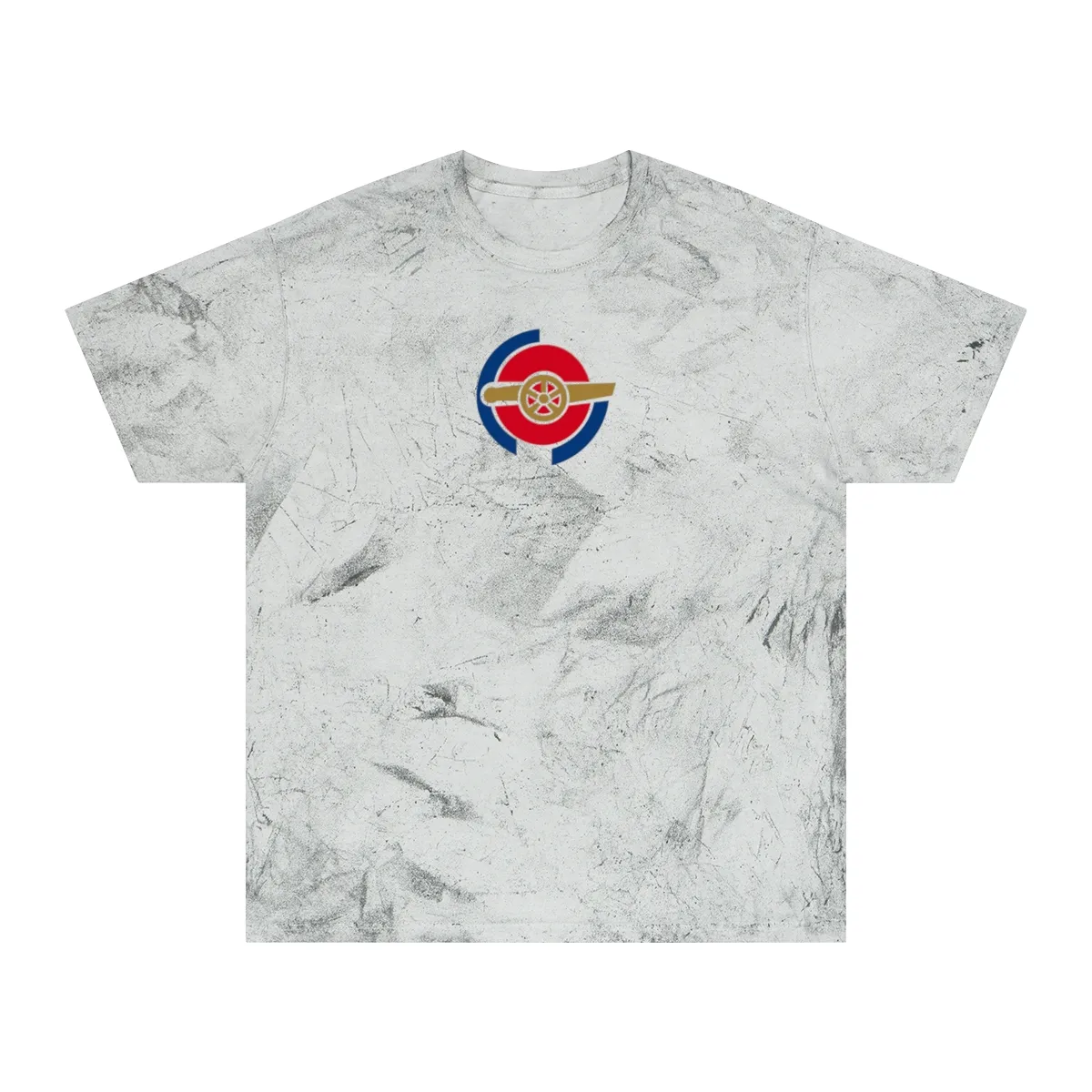
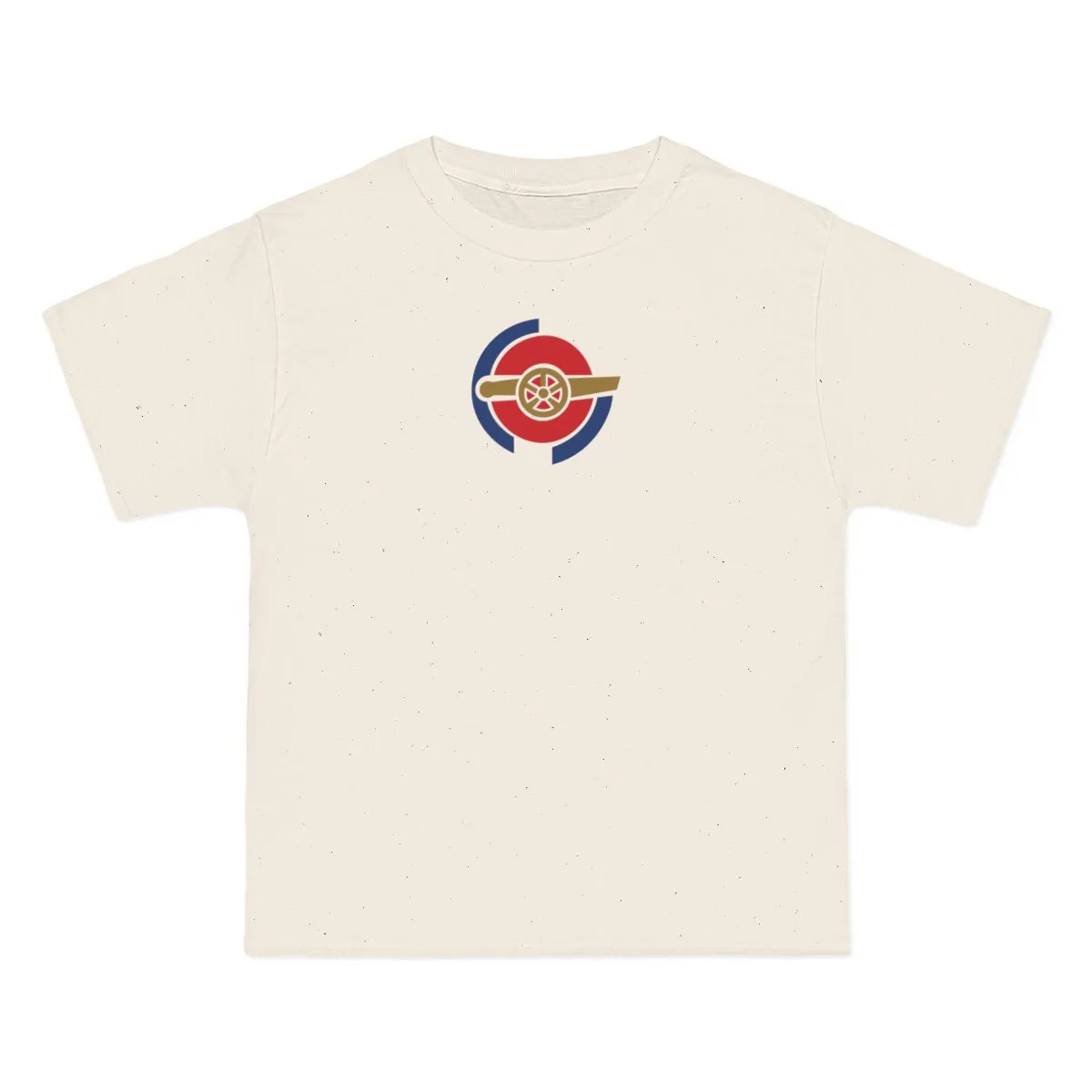
London Soccer
Red, Navy & Old Gold
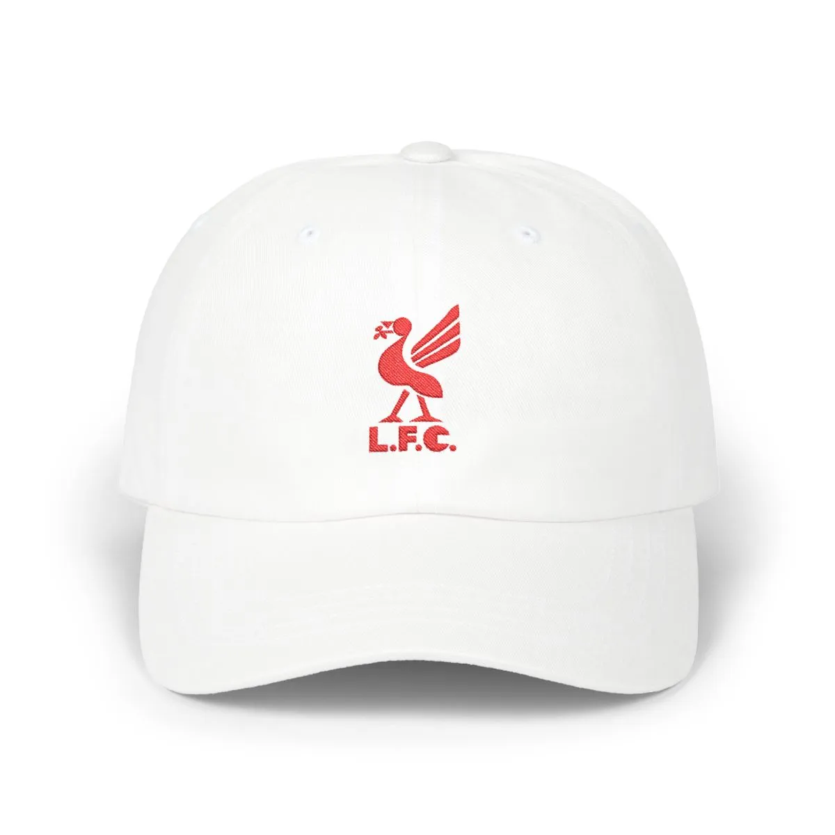
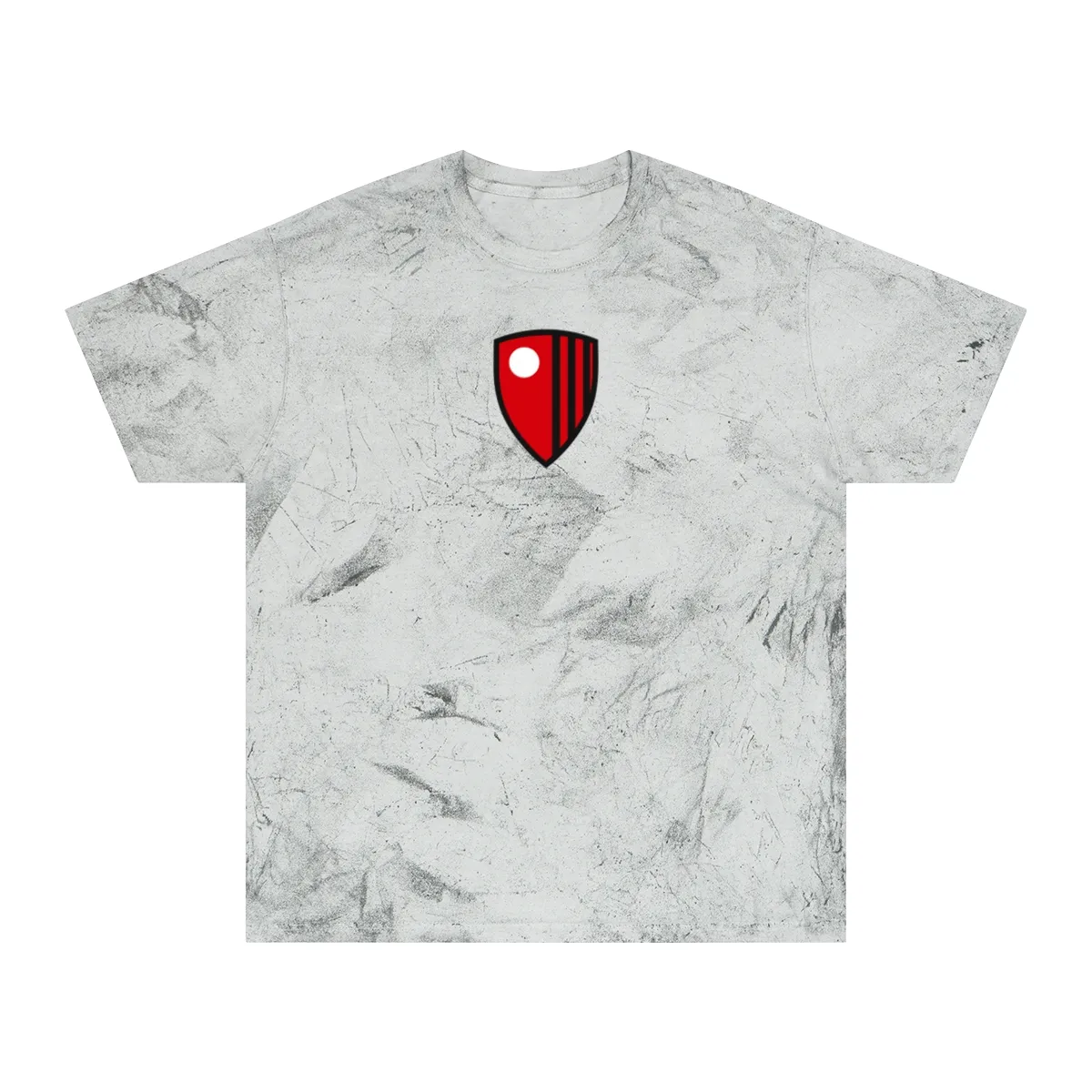
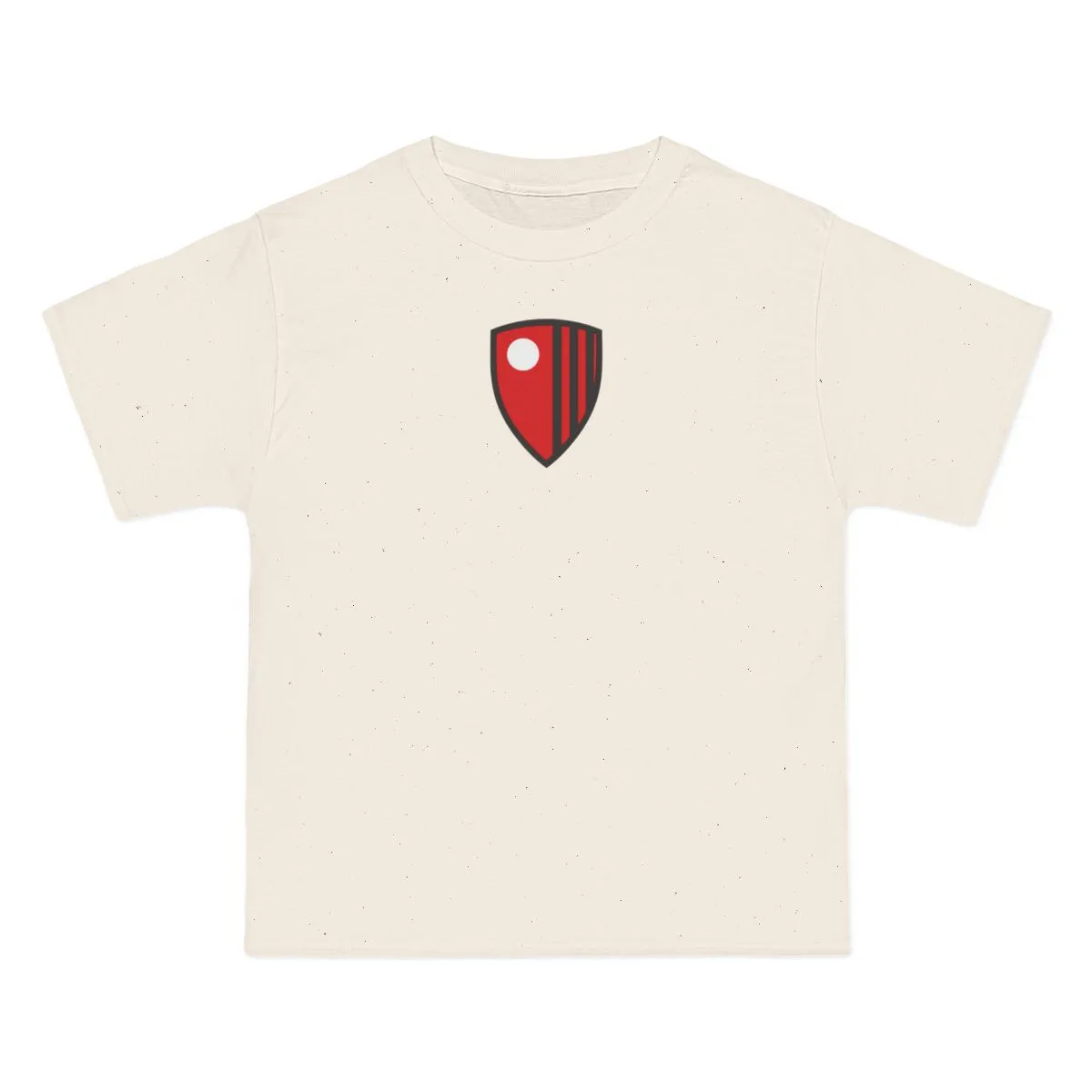
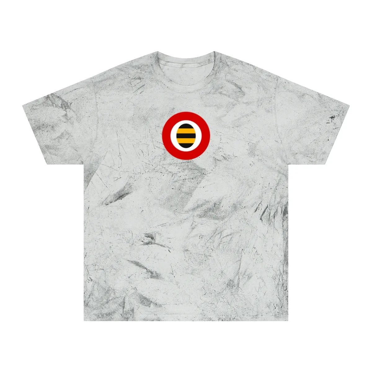
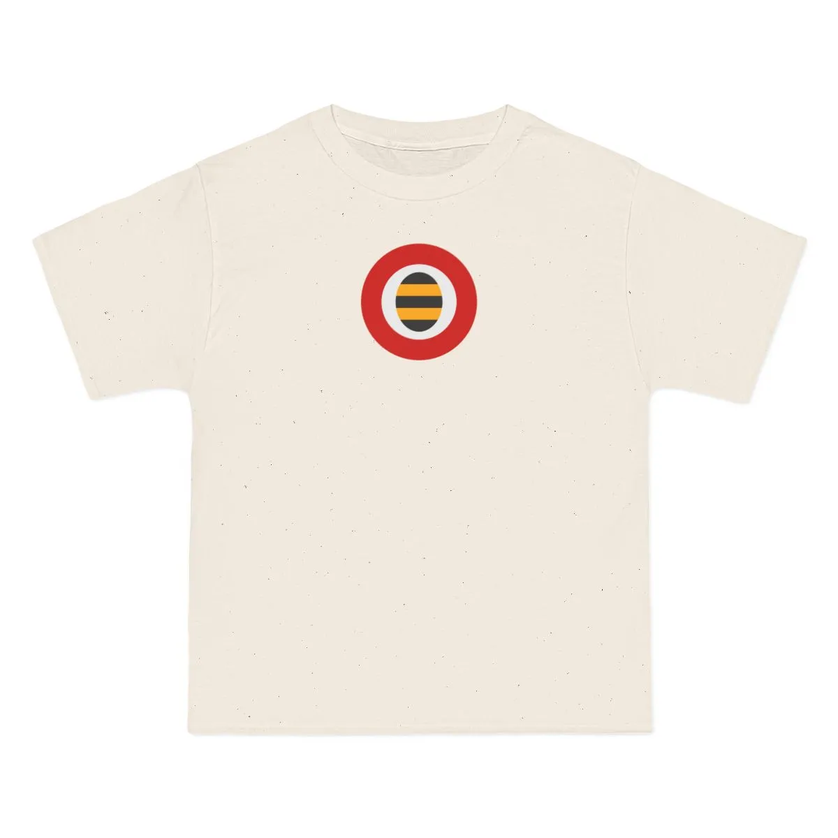
A red colorway, rebuilt as flat abstract shapes with no logo.
style
size
Red — the colors Liverpool has worn since 1892
The design pulls from Liverpool’s soccer heritage and translates it into a minimal red emblem made of simple geometry. It is rooted in Merseyside, with nods to neighborhoods like Walton and Kirkdale and the wider North West England scene where local pride runs deep.
Liverpudlians often wear their colors quietly, whether around Penny Lane or across the city. This cap keeps that spirit without leaning on obvious symbols, making it a subtle choice for anyone who wants the region’s soccer identity in a more understated form.
It depicts the visual language of Liverpool’s professional soccer club reduced to flat abstract shapes. The artwork uses a single red tone and removes all lettering, mascots, and logos.
The piece is intentionally logo-free so it can work as unbranded city-pride apparel rather than team merchandise. That makes it quieter, more wearable, and easier to pair with everyday clothing.
No. It is an independent abstract design inspired by the city’s soccer colors and crest geometry. It is not affiliated with, endorsed by, or licensed from any club or organization.
It is an unstructured cotton dad cap with a soft crown and stitched embroidery. The profile is low and relaxed, designed for casual everyday wear.
Red, Navy & Old Gold
Aqua, Gold & Maroon
Red, Black & White
Orange, White & Black
Not affiliated with, endorsed by, or licensed by any team, league, or organization.