
Boston Hockey Colors Without the Logo
An abstract interpretation of the Black, White & Gold colorway.
Colorway
Black, White & Gold — the colors Boston has worn since 1924
- BlackMadeira 1800
- WhiteMadeira 1801
- GoldMadeira 1951
From the North End to the West End, Bostonians wear their history quietly. This cap captures the essence of the Northeast's hockey capital using only shape and shade, avoiding the noise of commercial branding. It is a nod to the streets where the game was born, stripped of the usual identifiers.
The embroidery mirrors the geometry found in the city's oldest professional clubs, founded in 1924. Whether you are walking down Commonwealth Avenue or sitting near the Garden, this piece serves as a subtle marker of belonging. It is apparel for those who know the difference between fandom and fashion.
Artwork

Frequently asked questions
What does the design on the cap depict?
The artwork consists of flat, abstract geometric shapes derived from the visual language of Boston's professional hockey team. It uses the team's historic color palette but removes all logos, mascots, and text.
Why is there no logo on this hat?
This product is designed for individuals who prefer unbranded apparel. It offers city pride through color and geometry rather than official team insignia, making it a logo-free alternative to standard merchandise.
Is this an official team product?
No, this is an independent design inspired by the city's sports history. It is not affiliated with, endorsed by, or licensed from any professional team or league.
What material is the cap made of?
The cap is constructed from unstructured cotton, providing a soft, broken-in feel typical of dad hats. The design is applied via embroidery for durability and texture.
More from Boston
View all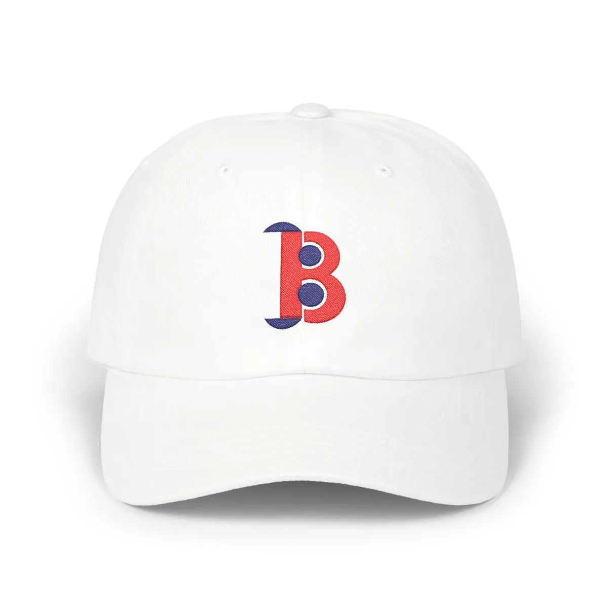


More Hockey
View all


More ways to browse
Not affiliated with, endorsed by, or licensed by any team, league, or organization.