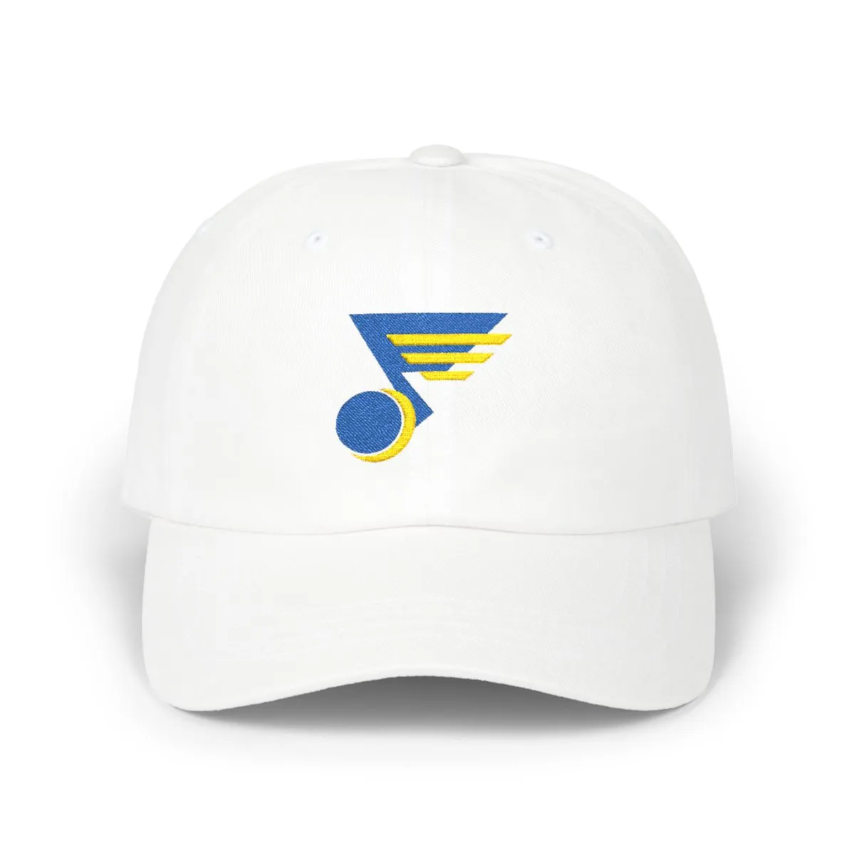
St. Louis Hockey Colors, Logo-Free
An embroidered dad cap in the Royal & Gold colorway.
Colorway
Royal & Gold — the colors St. Louis has worn since 1967
- RoyalMadeira 1842
- GoldMadeira 1951
For St. Louisans who love the game but not the branding. This cap translates the geometry of a local hockey club's identity into clean, abstract embroidery. It's a subtle signal, recognizable to those who know the city's colors from the riverfront to the neighborhoods of Downtown West and Soulard.
Made from soft, unstructured cotton, it breaks in perfectly. The Royal & Gold palette is a direct reference to the Midwest team that has defined the city's hockey scene since 1967. Wear the colors, skip the crest.
Artwork

Frequently asked questions
What does the design on the cap depict?
The design is an abstract interpretation of the visual elements from a St. Louis hockey club's crest. It uses the team's signature Royal & Gold colors to form geometric shapes, not a literal picture.
Why is there no logo on this hat?
This is intentionally logo-free apparel. It's designed for people who want to show city pride through color and shape without wearing an official team mark or wordmark.
Is this an official piece of team merchandise?
No. This is an independent design inspired by the city's hockey history and color palette. It is not affiliated with, endorsed by, or licensed from any professional team or league.
What kind of hat is this?
It's an unstructured cotton dad cap. This means it has a soft, low-profile crown that conforms to your head, a pre-curved brim, and an adjustable strap at the back.
More from St. Louis
View all
More Hockey
View all


More ways to browse
Not affiliated with, endorsed by, or licensed by any team, league, or organization.