New York Baseball
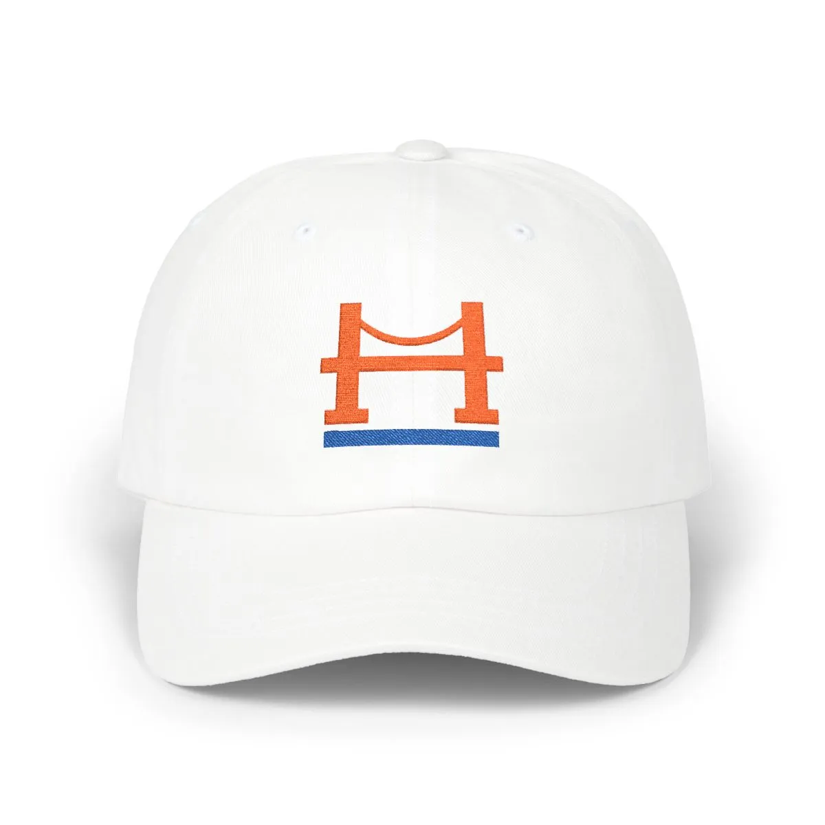
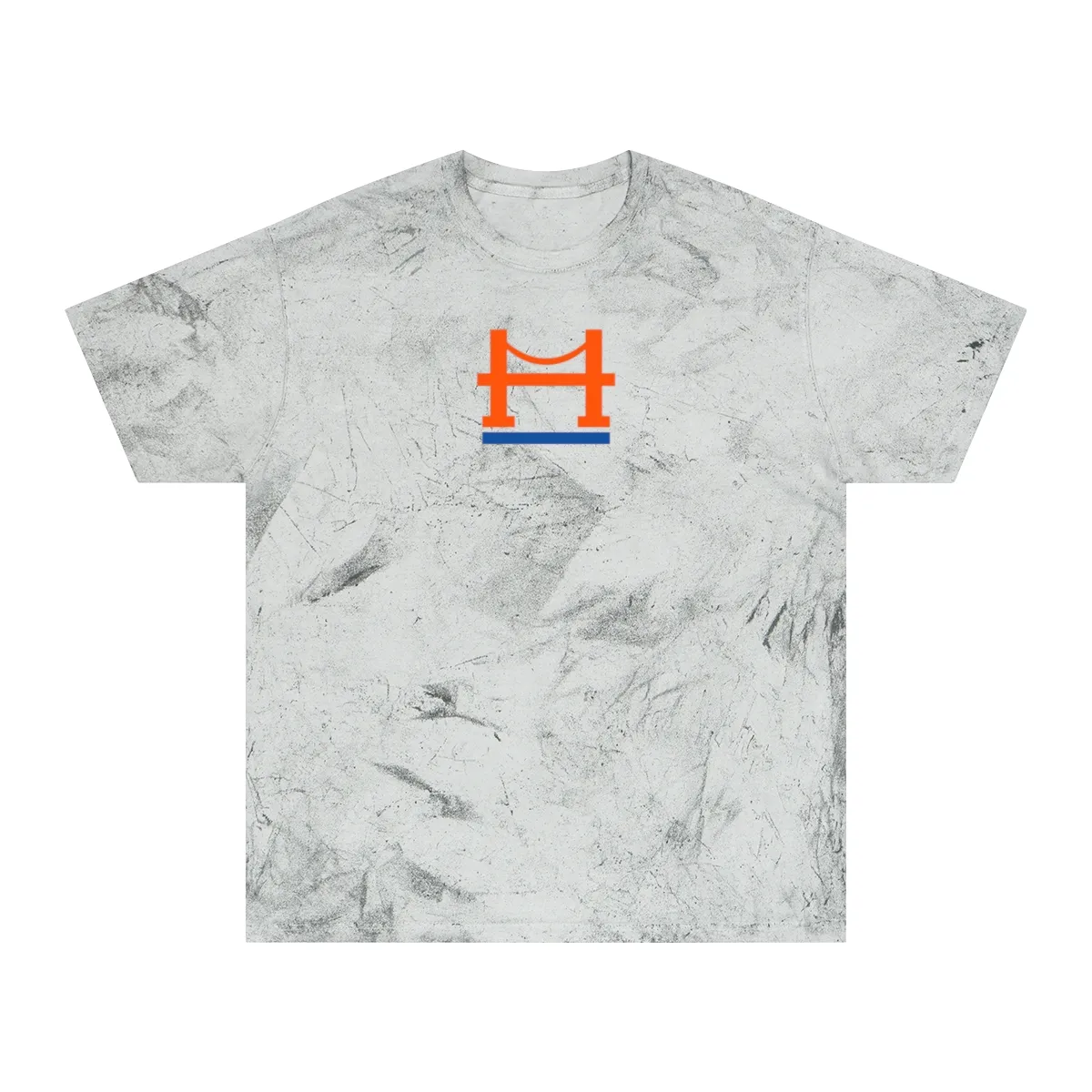
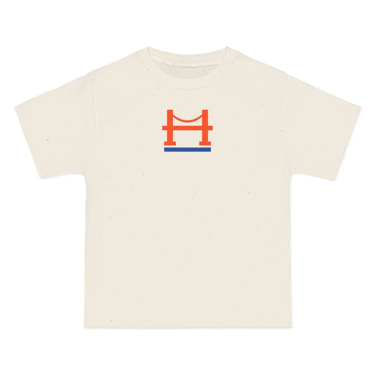
Orange & Royal
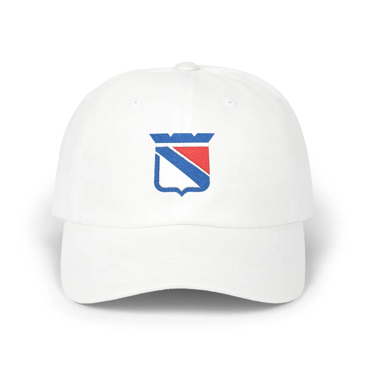
An abstract interpretation of the Royal, White & Red colorway.
style
size
Royal, White & Red — the colors New York has worn since 1926
This piece distills the visual language of New York hockey into pure geometry. It speaks to the Northeast’s deep-rooted sports culture, offering a way to wear the city’s palette without the noise of commercial branding. It is for New Yorkers who know the history but prefer a quieter expression.
From Midtown Manhattan to Hell’s Kitchen and SoHo, the colors resonate locally. The design uses the specific royal, white, and red tones associated with the city’s professional hockey side, rebuilt as abstract shapes. It is a nod to the 1926 founding era, stripped of all wordmarks and mascots.
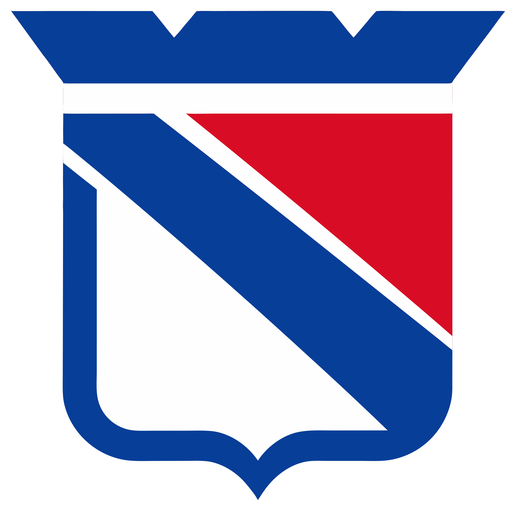
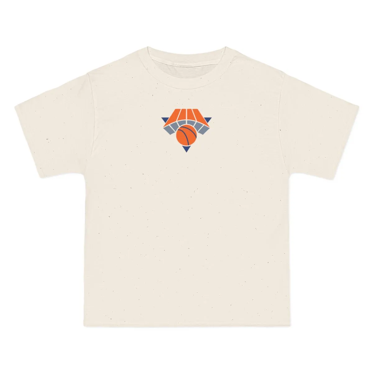
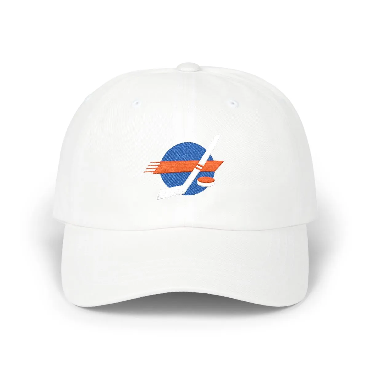
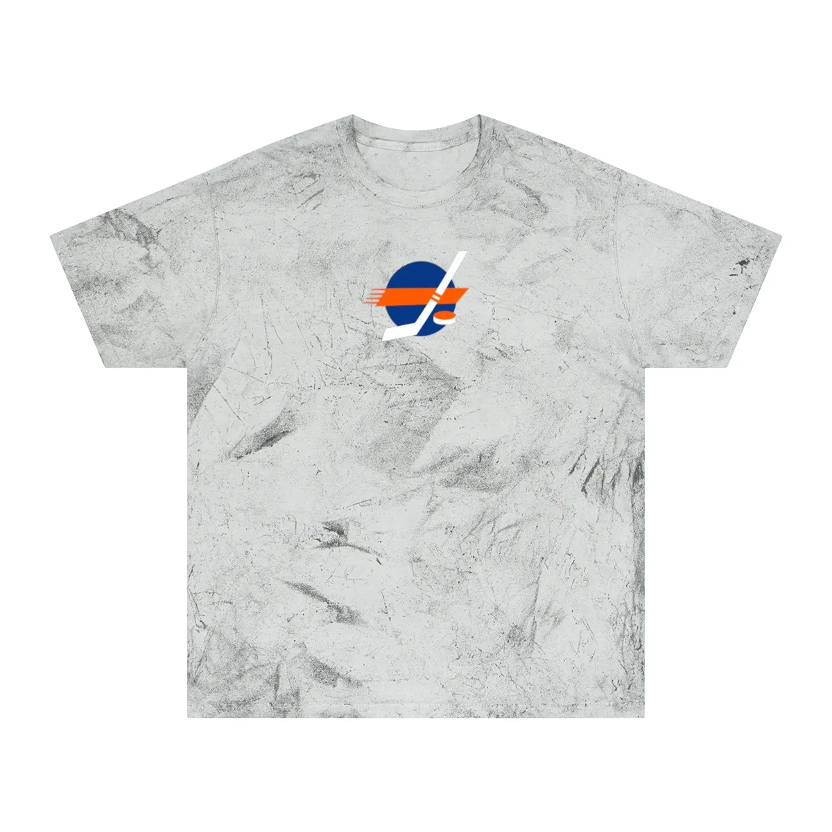
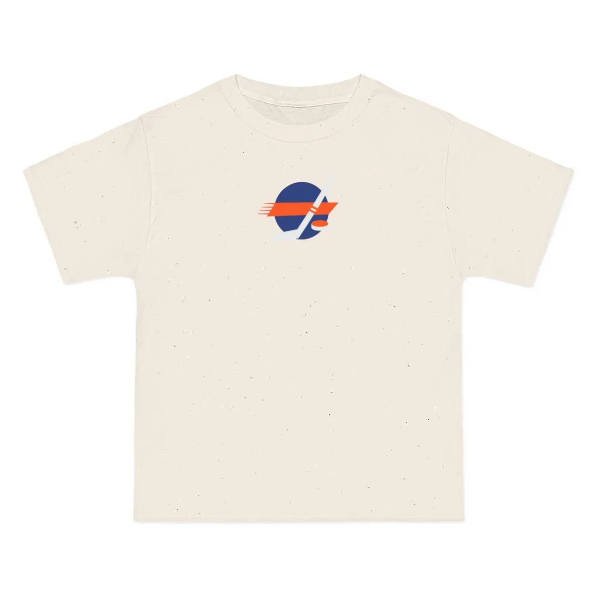
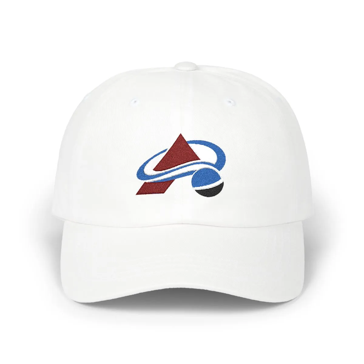
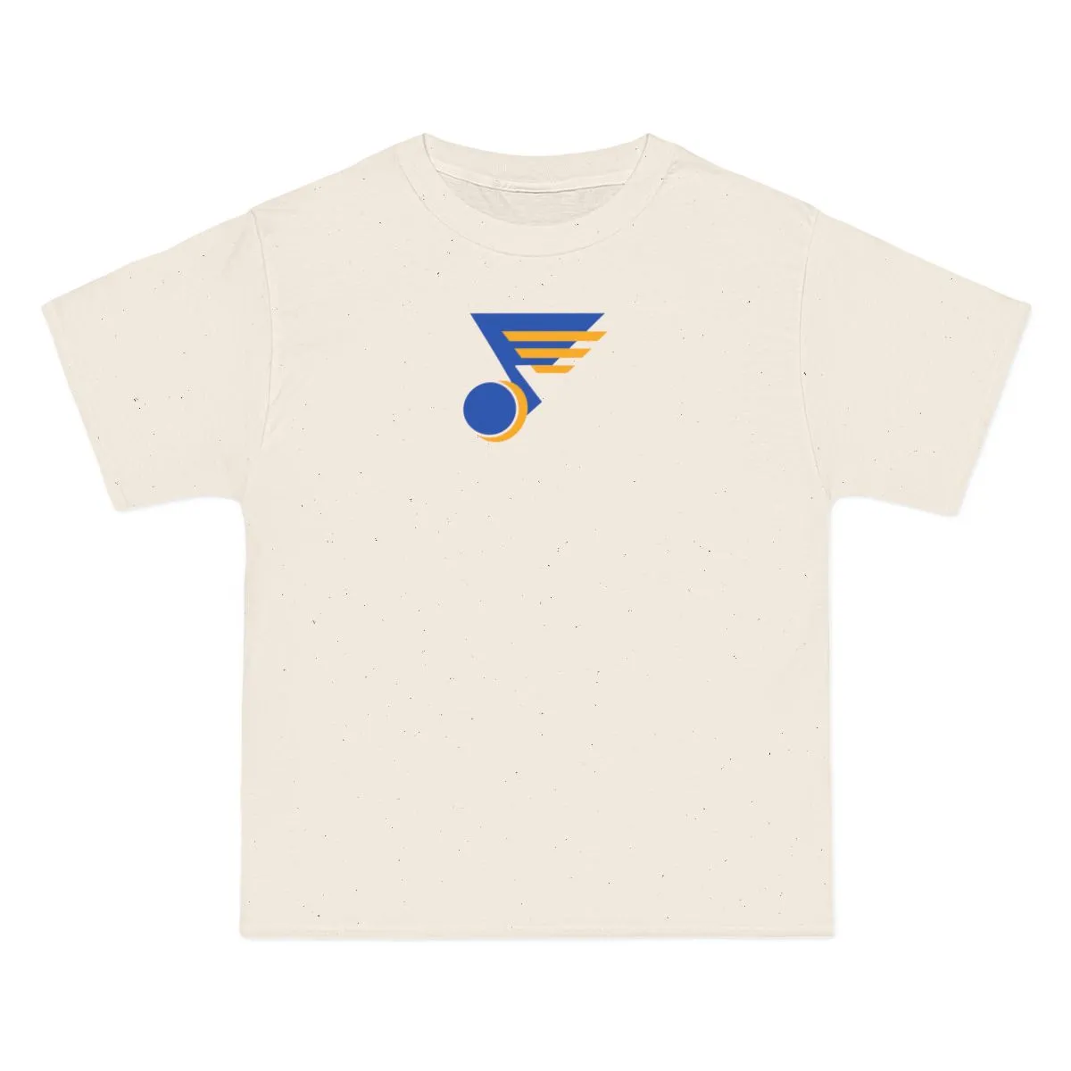
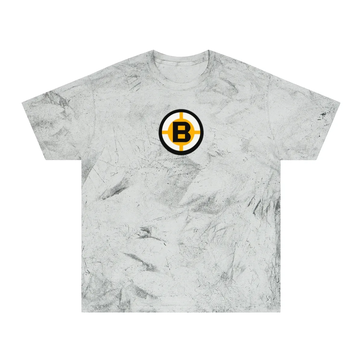
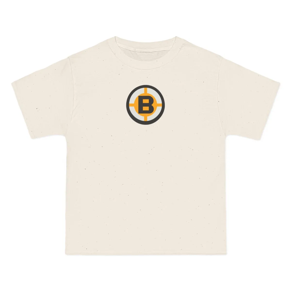
The design depicts abstract geometric shapes derived from the crest geometry of New York's professional hockey club. It uses the team's traditional Royal, White & Red colorway but removes all logos, text, and mascots.
This is intentionally logo-free apparel. It is designed for buyers who want to express city pride through color and shape rather than wearing official team branding or trademarks.
No, this is not official merchandise. It is an independent, unbranded design inspired by the color palette and geometric history of New York hockey.
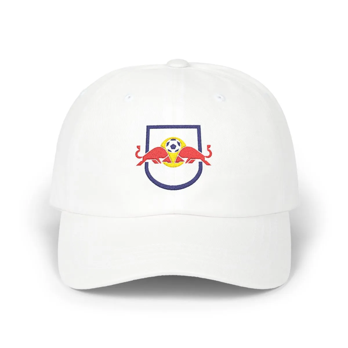
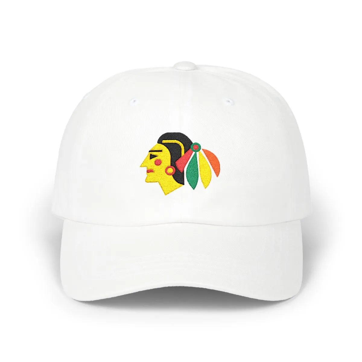
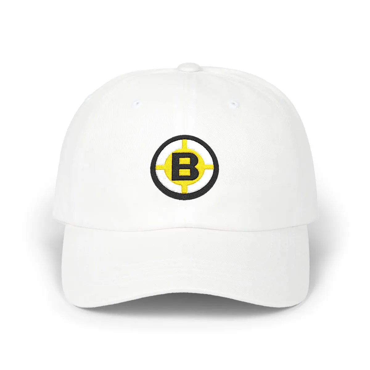
The cap is an unstructured dad hat made from cotton. It features embroidered artwork in royal blue, white, and red threads.
Orange & Royal
Navy, Red & Gold
Orange, Grey & Royal
Royal, Orange & White
Royal, Maroon & White
Gold, Black & Kelly Green
Royal & Gold
Black, White & Gold
Not affiliated with, endorsed by, or licensed by any team, league, or organization.