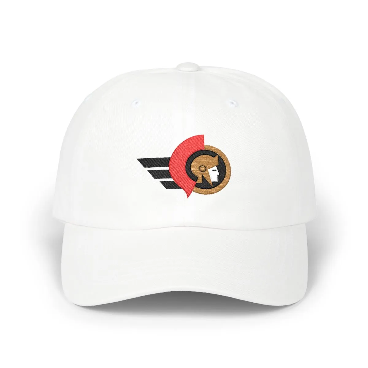
Ottawa Hockey Colors Without the Logo
An abstract embroidery in Black, Red & Old Gold.
Colorway
Black, Red & Old Gold — the colors Ottawa has worn since 1992
- BlackMadeira 1800
- RedMadeira 1839
- Old GoldMadeira 1672
- WhiteMadeira 1801
From the ice of the Rideau Canal to the stalls near Parliament Hill, Ottawa's hockey culture runs deep. This cap captures that spirit for residents of Centretown, The Glebe, and beyond, offering a subtle nod to the local game without the noise of a traditional wordmark or mascot.
We rebuilt the visual identity of the city's professional hockey side into clean, flat shapes. The result is a piece of unbranded apparel that speaks to Ottawans who prefer their city pride expressed through color and form, not corporate logos.
Artwork

Frequently asked questions
What does the design on the hat actually depict?
The artwork consists of flat, abstract geometric shapes derived from the crest of Ottawa's professional hockey club. It uses the team's signature colors—black, red, and old gold—but removes all text, mascots, and recognizable logos.
Why is there no logo on this cap?
This design is intentionally logo-free to offer a more subtle way to show city pride. It appeals to those who want to represent Ottawa's hockey culture through color and geometry without wearing explicit team branding.
Is this an officially licensed product?
No, this is an independent design inspired by the color palette and geometric elements associated with Ottawa's hockey history. It is not affiliated with, endorsed by, or licensed from any professional sports organization.
What kind of hat is this?
It is an unstructured cotton dad cap with a curved brim and a soft crown. The fit is relaxed and adjustable, designed for casual, everyday wear rather than performance athletic use.
More Hockey
View all


More ways to browse
Not affiliated with, endorsed by, or licensed by any team, league, or organization.