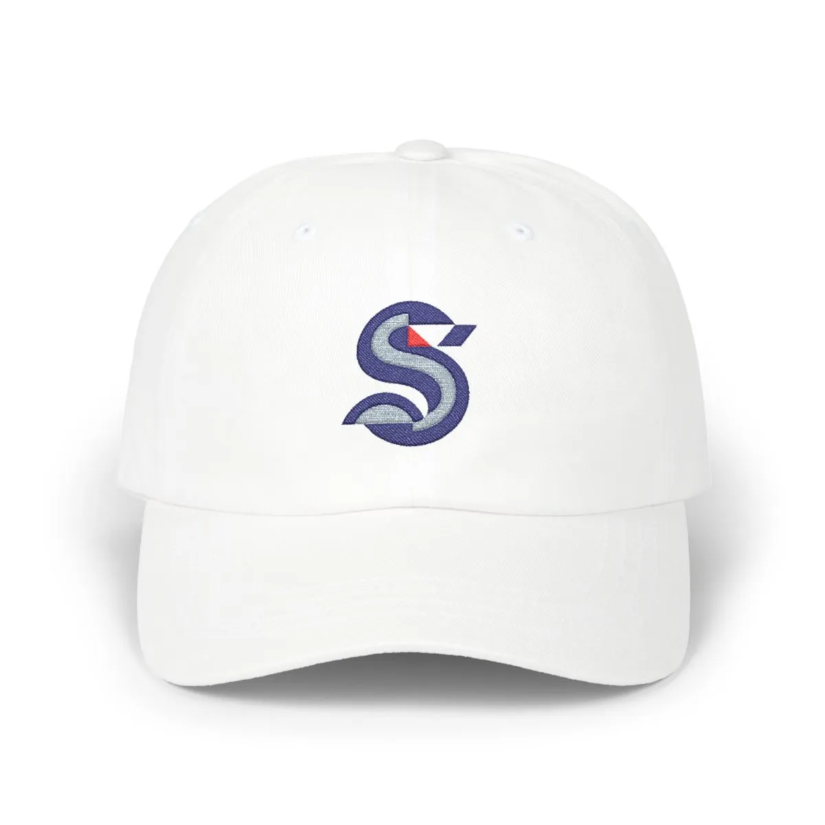
Seattle Hockey Dad Cap Abstract Design
Embroidered in a navy, grey, and red colorway.
Colorway
Navy, Grey & Red
- NavyMadeira 1966
- GreyMadeira 1718
- RedMadeira 1839
Wear the Pacific Northwest's hockey spirit without the noise. This cap draws from the geometric roots of Seattle's professional teams, translating them into clean, abstract embroidery. It is a tribute to the city's sports culture, designed for Seattleites who prefer subtlety over slogans.
From Queen Anne to South Lake Union, the look fits the rainy, urban landscape. The navy, grey, and red palette reflects the visual identity of the local hockey scene. No logos, no names, just the colors and shapes that define the city's athletic pride.
Artwork

Frequently asked questions
What does the design on the cap depict?
The design depicts abstract geometric shapes derived from the visual language of Seattle's professional hockey team. It uses a specific navy, teal, and red colorway to represent the team's identity without using any logos or text.
Why is there no logo on this hat?
This product is intentionally logo-free to offer a minimalist alternative to traditional fan merchandise. It allows wearers to express city pride through color and shape rather than explicit branding or mascots.
Is this an official team product?
No, this is an independent design inspired by the colors and geometry of the city's professional hockey club. It is not affiliated with, endorsed by, or licensed by any team or league.
What material is the cap made of?
The cap is made from unstructured cotton, offering a soft and relaxed fit. The design is applied via embroidery, ensuring durability and a textured finish against the fabric.
More from Seattle
View all

More Hockey
View all
More ways to browse
Not affiliated with, endorsed by, or licensed by any team, league, or organization.